Salt Lake Bees update brand in advance of move
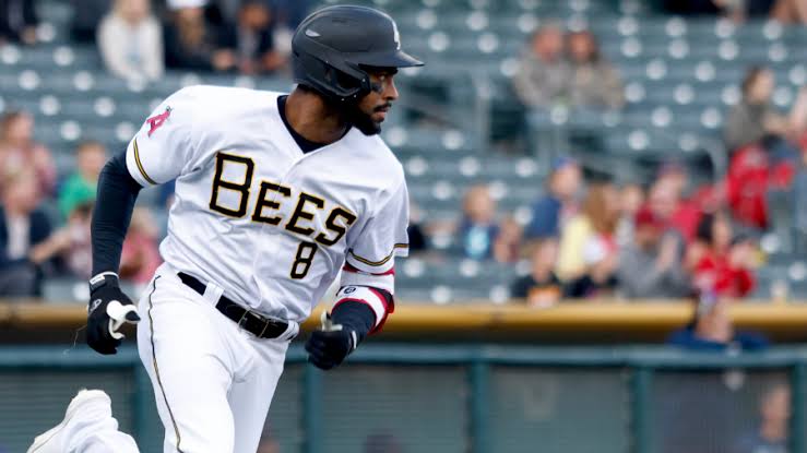
The Triple-A Salt Lake Bees updated their identity in preparation for their move to a new ballpark in 2025. The new look maintains the popular bee character, a staple in the minor league baseball landscape since 2006, while updating the typography and adding some alternate identities. The new type, which is included in the primary logo and the interlocking cap logo, is meant to allude to the sting of a bee.
The interlocking SL cap logo pre-dates the Bees in Salt Lake City, with previous teams in the city like the Gulls and the Trappers using a version of the baseball custom in the 1970s and ’80s.
New alternate identities pay tribute to the state of Utah, including one that features the state outline with the word Bees set in a descending staircase that evokes a classic logo from the team’s parent club, the Los Angeles Angels.
Another alternate pays homage to the Beehive State with a beehive icon. If you’ve driven through Utah, you’ll know this symbol from the state’s highway signs.
Yet another alternate sets pair of crossed bats within a honeycomb, with icons of a baseball and the state of Utah set opposite the letters S and L.
The new Bees look pays tribute to teams from the early 20th century with a recreation of a bee illustration on uniforms from the 1920s.


